Let us improve your website security and performance!
Review our available services and improve your online presence.

Building grid layouts for our website is not something WordPress makes easy out of the box —far from it. To tackle this challenge without losing our minds, we have no choice but to rely on a plugin. And yes, there are quite a few designed specifically to fill this gap.
Among them, one stands out like Messi on the soccer field: WP Grid Builder. This plugin provides a complete solution for searching, organizing, and filtering WordPress content with impeccable presentation. In this article, we’ll explore its strengths, but also a few aspects that might be less than ideal.
Grid layouts offer an appealing way to display and filter content on our website. This is both desirable and necessary to provide users with a clean and elegant experience. Take, for instance, something like this:
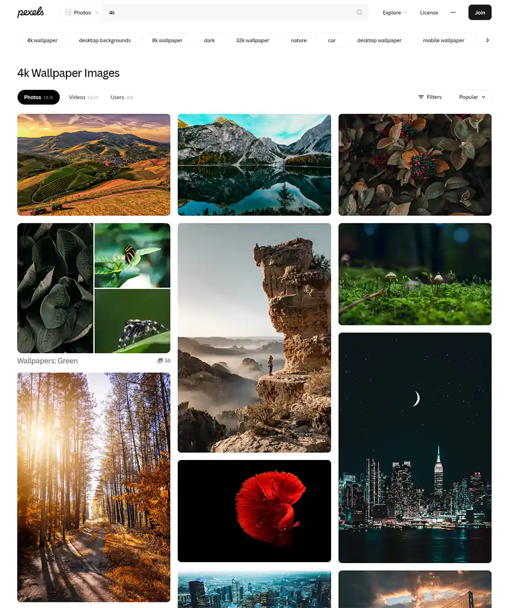
And another example follows:

This is the very reason WP Grid Builder exists: a carefully crafted plugin that allows us to quickly create advanced grid layouts in WordPress through an intuitive, easy-to-use interface. Out of the box, the plugin comes packed with optimal features designed for both beginners and developers alike.
For those who are new to web development, WP Grid Builder offers a practical solution to create flexible, filterable grid layouts without needing any programming knowledge. However, if we have some development skills —or if we’re professional web designers— the grid builder spoils us with numerous actions and functions that will keep us glued to our seats for hours.
WP Grid Builder works seamlessly with all WordPress themes and integrates flawlessly with most popular plugins (such as WooCommerce). Additionally, it includes extra add-ons that expand its capabilities, offering even more functionality and flexibility for our grids and search filters (commonly referred to as “facets”).
WP Grid Builder brings all the essential tools to create professional-grade grid layouts. Unlike its competitors, this plugin proves highly practical when designing an online store, portfolio site, blog, or any other type of website.
Here are some of its standout features:
As we can see, WP Grid Builder provides a comprehensive set of tools and features to customize and optimize grid layouts, enhancing both the aesthetics and functionality of any website.
WP Grid Builder is included for free in our WordPress Maintenance Plan
At the time of writing, this plugin does not offer a free version. Therefore, to use it, we must purchase at least the single-site plan, which costs $49 per year. Once purchased, we can download the .zip file and upload it via the Plugins section in our WordPress dashboard.
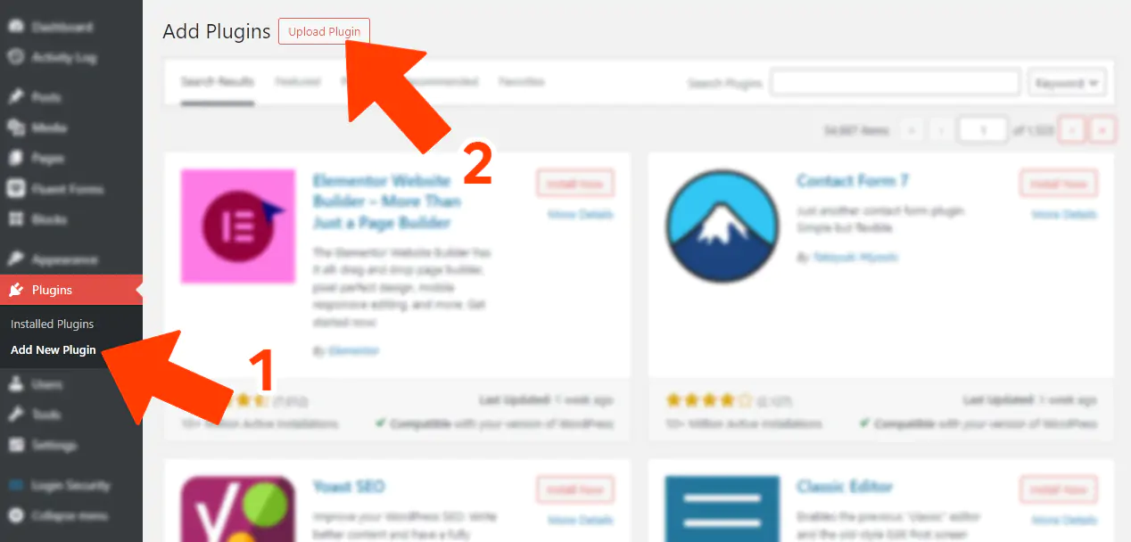
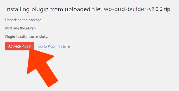
Next:
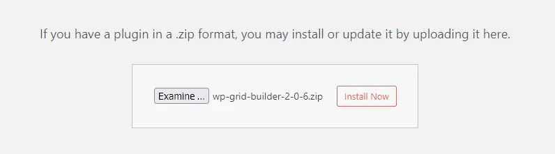
After this step, we can activate it using the corresponding button.
Here, we can enter the key (which we should have received via email after purchase) to activate the license.

Next, we’ll go step by step through creating our first grid in a practical Grid Builder guide with screenshots.
Let’s start by creating a new grid by clicking on the options shown in the screenshot below:
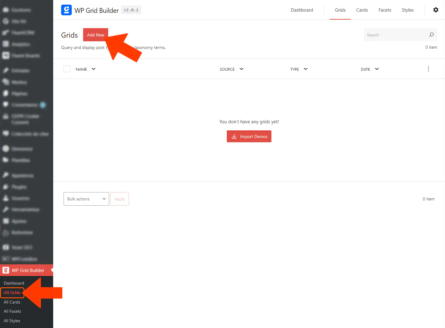
Clicking the “Add New” button will take us to the following screen.
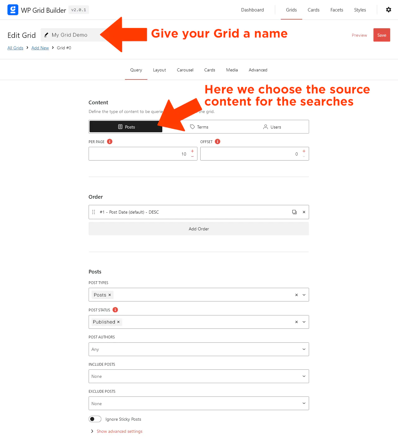
As shown in the screenshot above, we have three types of sources to fetch content from (unless we’ve added other content types, such as when installing WooCommerce):
Below these options, we can set the number of items per page (default is 10).
If we want to display everything, we should enter “-1”, while “0” uses the default value from WordPress settings.
Further down, we can define how results are sorted (by default, by creation date) and add additional sorting rules via the “Add Order” option.
Finally, we can refine additional settings, such as including or excluding specific authors or posts.
Always remember to click the SAVE button to apply changes.
Now, let’s take a look at the options available in the Layout tab.
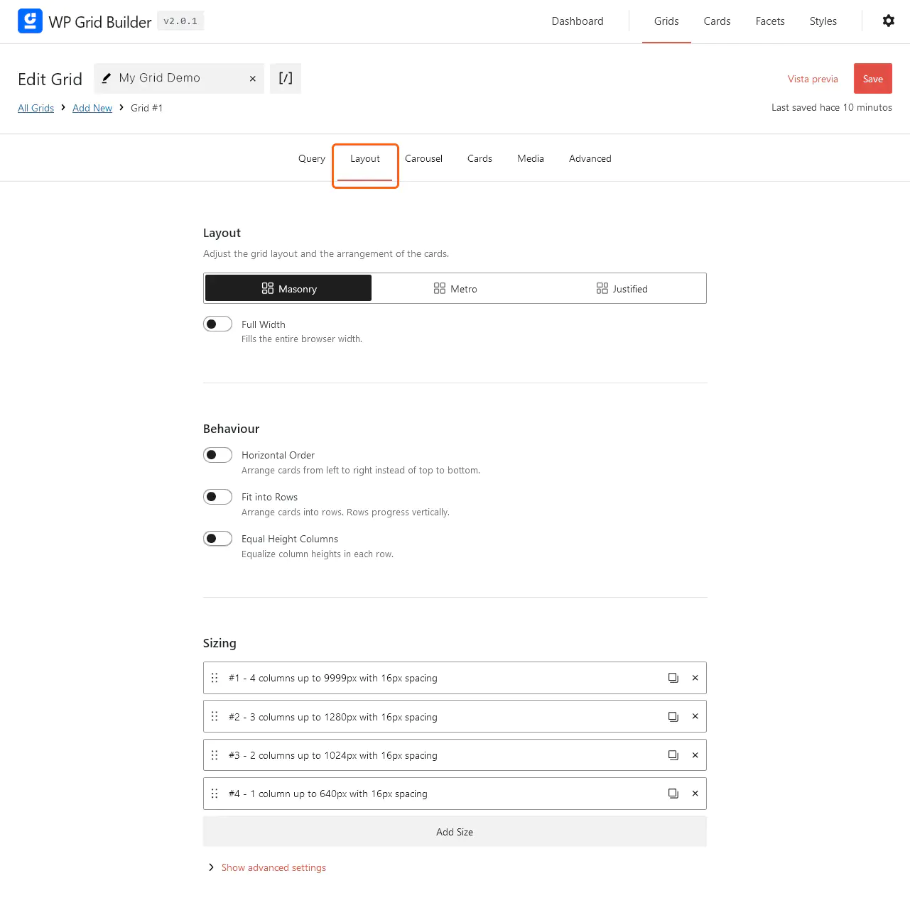
Here, we’ll explore the design options, meaning how our grid will look—its visual personality in the eyes of our users.
The first thing we can choose is the layout type: Masonry, Metro, or Justified. This is an important decision, as each option produces a distinctly different result. Let’s take a closer look:
The Masonry grid layout arranges elements in a brick-like structure (similar to how bricks are stacked in a wall). This design allows elements of different heights to fit tightly together without leaving blank spaces.
There is no fixed row height in Masonry, as element heights can vary. Items are placed in the next available position in the shortest column, creating a structured yet visually balanced appearance. This layout is ideal for image galleries and portfolios where images have different proportions.
Example: Pinterest uses a Masonry grid layout.
The Metro layout is inspired by the design style popularized by the Windows 8 user interface. It consists of blocks of varying sizes and shapes that fit within a grid—a mix of large and small elements that create a more dynamic composition.
Although elements follow a strict grid structure, some blocks can span multiple columns or rows depending on their size. This design is often chosen for modern, visually engaging layouts that appeal to specific types of content.
The Justified grid layout arranges elements in rows of equal height, aligning the left and right edges of each row. It’s a popular choice for photography and image galleries.
Each row maintains the same height, and the elements adjust in width to completely fill the space without gaps. This creates a clean, organized, and evenly aligned appearance.
Example: Flickr uses a Justified grid layout for its photo galleries.
After selecting the presentation style, we can also enable Full Width, allowing the grid to span the entire screen from left to right, displaying the results across all available space.
Now, let’s explore the Behavior options. These settings control how cards are arranged and displayed within a grid. Below are the three available options:
This option arranges the cards from left to right instead of top to bottom. It’s useful for designs where content should flow horizontally before moving to the next row.
Best for: Carousels or horizontal galleries where content needs to be explored laterally.
This setting organizes cards into rows that progress vertically, meaning they align one below the other. This makes the grid easy to read and navigate, ensuring a structured display.
Best for: Image galleries and portfolios that require a clean, consistent presentation of visual elements.
This option ensures that all columns within a row have the same height, creating a neat, balanced look. It’s particularly useful for grids that require uniform column heights to enhance readability and visual appeal.
Best for: Designs where consistent column height improves aesthetics and readability.
Finally, using the Sizing settings, we can customize the grid’s size based on screen width (e.g., adjusting for mobile devices). This allows for further personalization according to our preferences.
Now, let’s move on to the next configuration tab: Carousel.
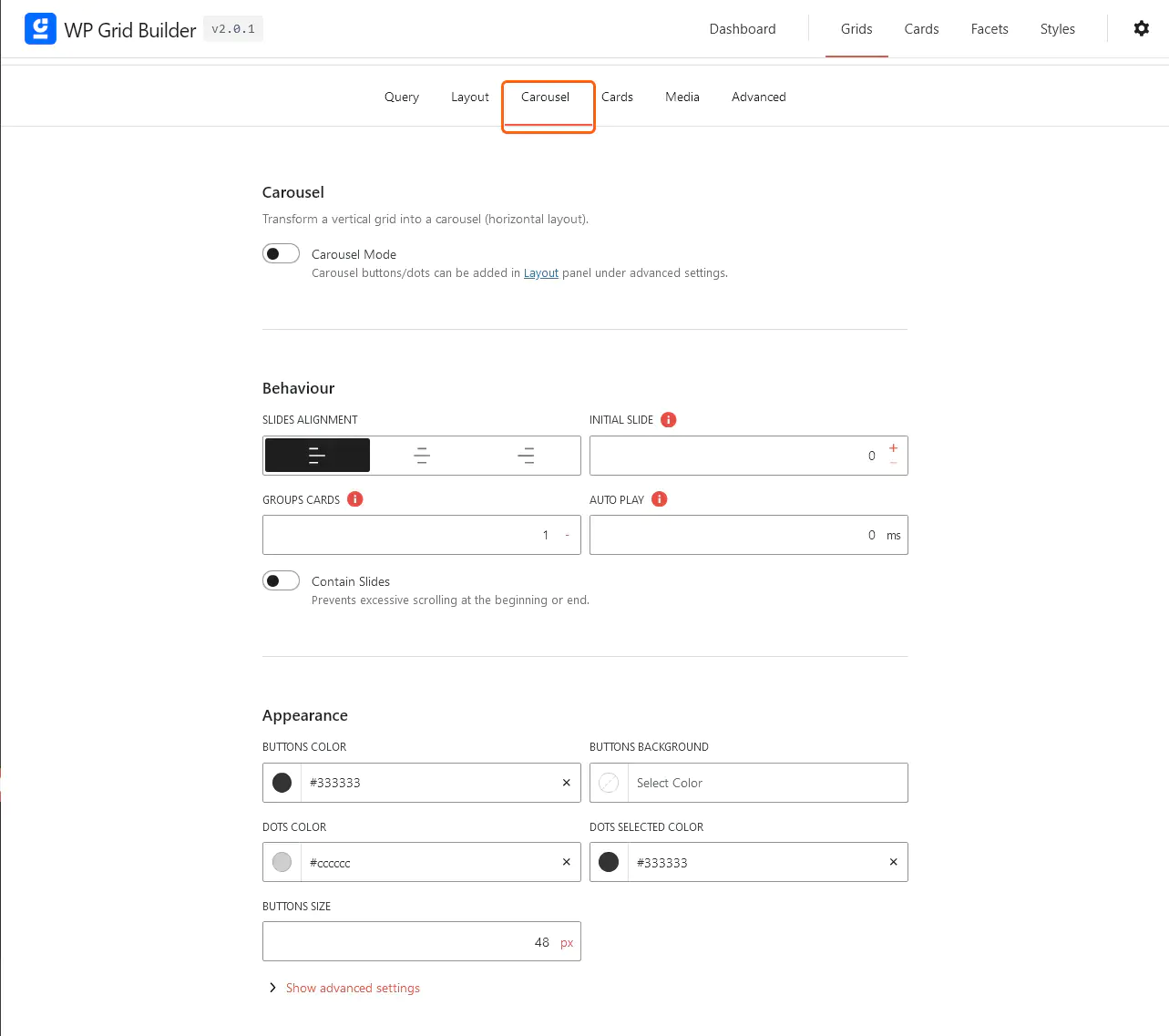
The first option is critical —if we intend to transform our grid content into sliding images, we must enable it.
This feature allows the grid layout to display content horizontally and scrollably. Instead of showing all content on screen at once, the carousel enables users to navigate through the grid horizontally, either by swiping or clicking navigation buttons.
It’s a dynamic, interactive way to present content —especially considering that screen space is often limited.
In the next Behavior section, we can fine-tune the carousel’s behavior, including slide arrangement. The key settings are:
In the final Appearance settings, we’ll define colors and button sizes to customize the visual style.
Now, let’s move on to configuring Cards.

In this section, we will decide what type of design we want for our Cards. We can create multiple Card designs and use them in any type of grid we need. For example, we might have one design for carousel grids, another for standard grids, or even a specific design for WooCommerce products if we’re using that.
Cards must be created beforehand in the All Cards section, so for now, let’s skip ahead.
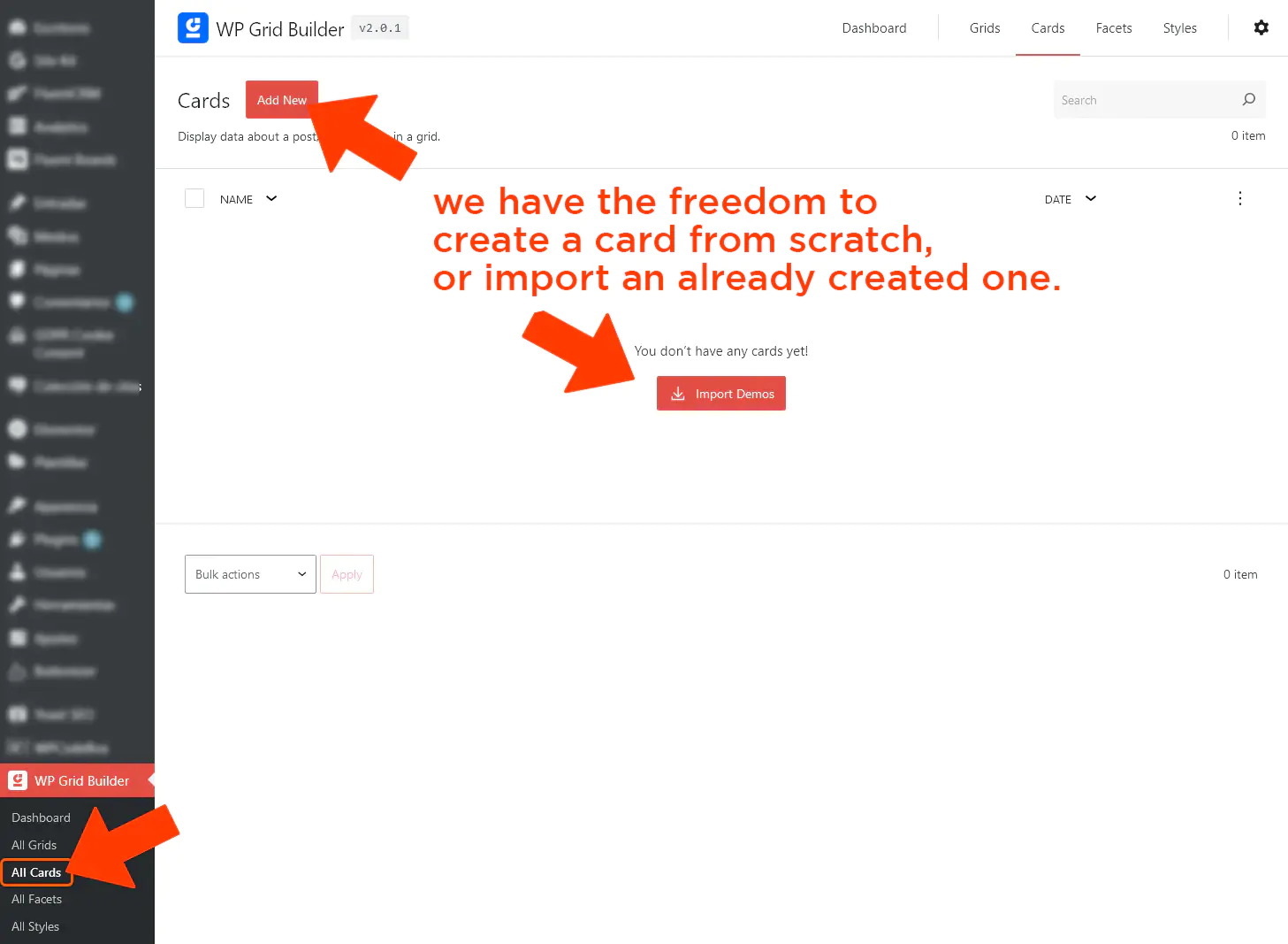
In order to streamline the process and explore the variety of built-in designs WP Grid Builder offers, we’ll import the demo templates. To do this, we clicked Import Demos, which brought up the following pop-up window.
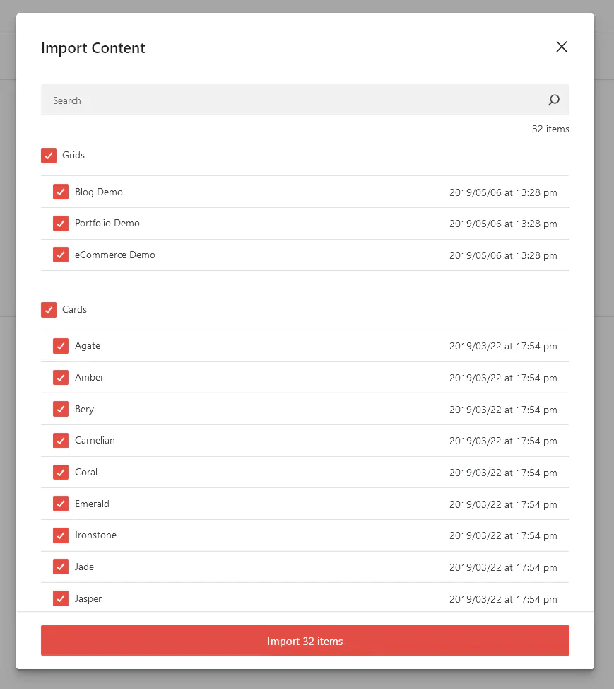
As seen in the screenshot above, we have access to various designs for blogs, portfolios, WooCommerce, and a selection of templates named after colors (Agate, Amber, Coral, Emerald, etc.). We’ll import only what we need or want to experiment with.
After this step, we’ll see the list of imported Cards.
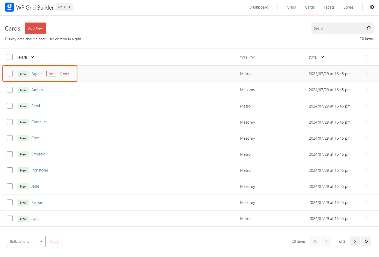
In the screenshot above, we can see that hovering over a Card row allows us to edit it. Let’s take a look at what happens when we click the Edit button.
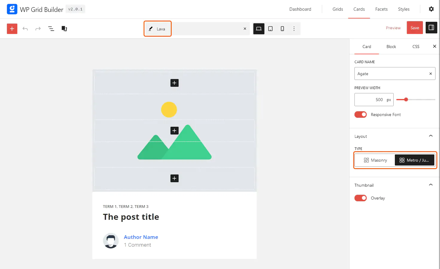
This brings us to the Gutenberg blocks that make up the Card. We can add more blocks, remove what we don’t need, and tweak the design as much as we like. Pay special attention to the Type of Card, where we can choose Masonry or Metro, depending on our preferred layout. In this example, the Card template is called “Lava” and is designed for a blog.
Let’s return to the Card design section.
To display data from Posts, Terms, or Users in our grid, we need to assign Cards. However, Cards are not explicitly assigned—WP Grid Builder will automatically apply a default Card that only displays the post thumbnail or user avatar (if available).
Continuing with our guide, we’ll type “Lava” in the Card field to select it.

Cards can be assigned based on conditions, depending on the data queried in the grid. For example, we can assign specific Cards to Posts containing certain terms or custom fields. We can also set conditions for mobile devices or different User scenarios. As we’ll see, WP Grid Builder offers remarkable flexibility.
In this tab, we also have options for Sizing. This allows us to globally override the number of rows and columns used for all Cards within the grid—these settings apply exclusively to Masonry and Metro layouts.
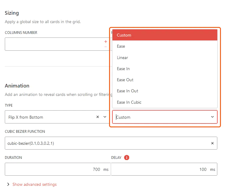
Finally, under Animation, we can configure how Cards appear and transform as users scroll.
As we navigate through the page, animations will dynamically reveal Cards within the grid, enhancing the visual appeal of the content and potentially increasing user engagement. There are several animation options to choose from.
Be sure to save your changes. Now, let’s move on to the Media section, where we can configure how media files are displayed based on the query.
In this panel, we can determine which media formats are allowed in our Cards. With a single click, we can enable or disable gallery, audio, or video formats using the corresponding toggle buttons.
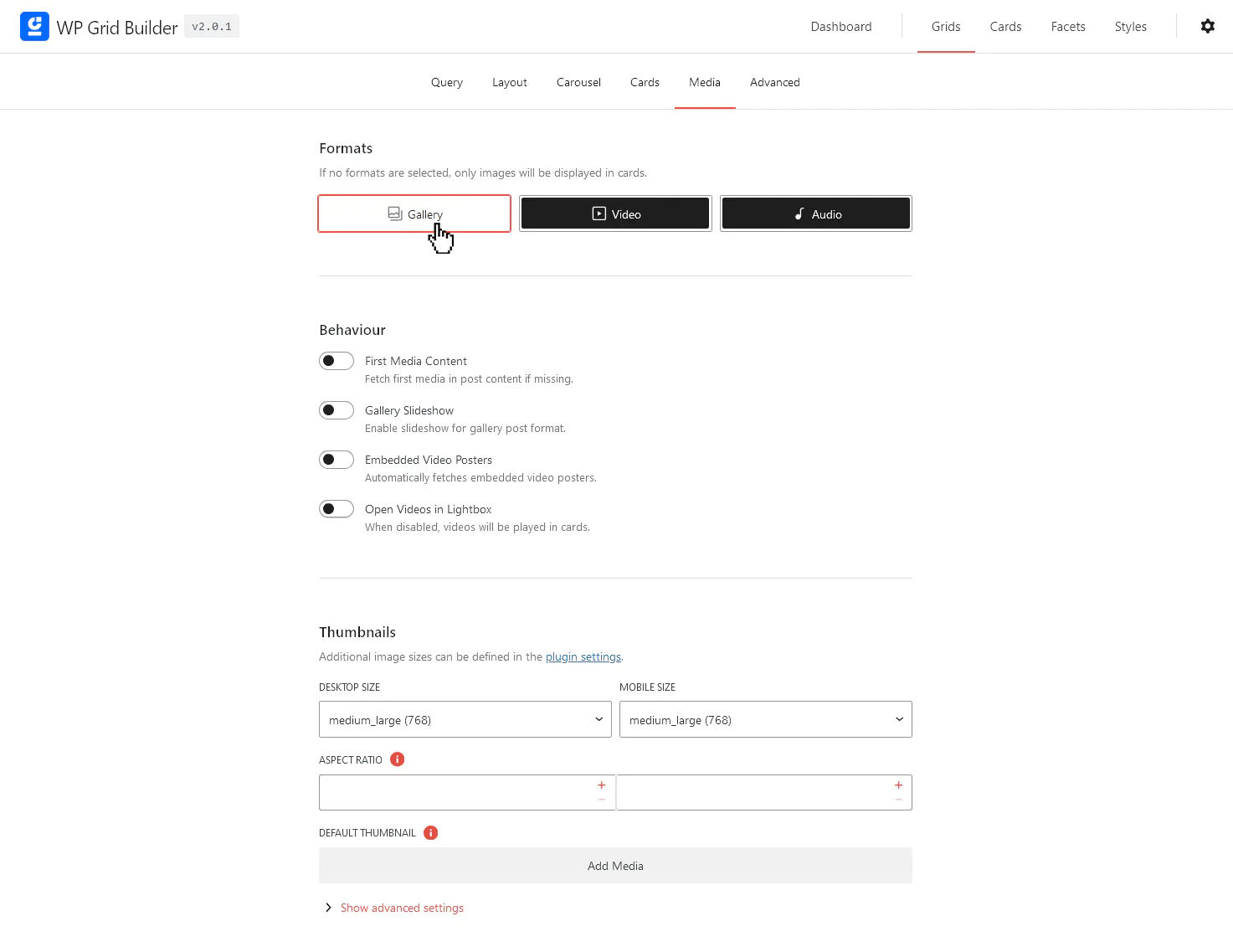
WP Grid Builder offers the ability to automatically retrieve the first media element from a Post’s content if no featured image has been assigned. If this is what we want, we can enable the First Media Content option. Additionally, we have the option to display thumbnails for embedded videos and to show videos in a Lightbox-style frame.
Next, under Thumbnails, we can adjust default sizes and layouts, even considering different settings for mobile devices.
In the final tab, we can customize messages, the appearance, and the functionality of the grid to better fit our specific preferences and requirements.

Adapting messages to our language or website’s tone is important, but the rest of the fields require advanced programming knowledge and will not be covered in this quick guide.
We can always preview our grid as we configure it, but now let’s take a look at how our demo grid is shaping up: Voilà.
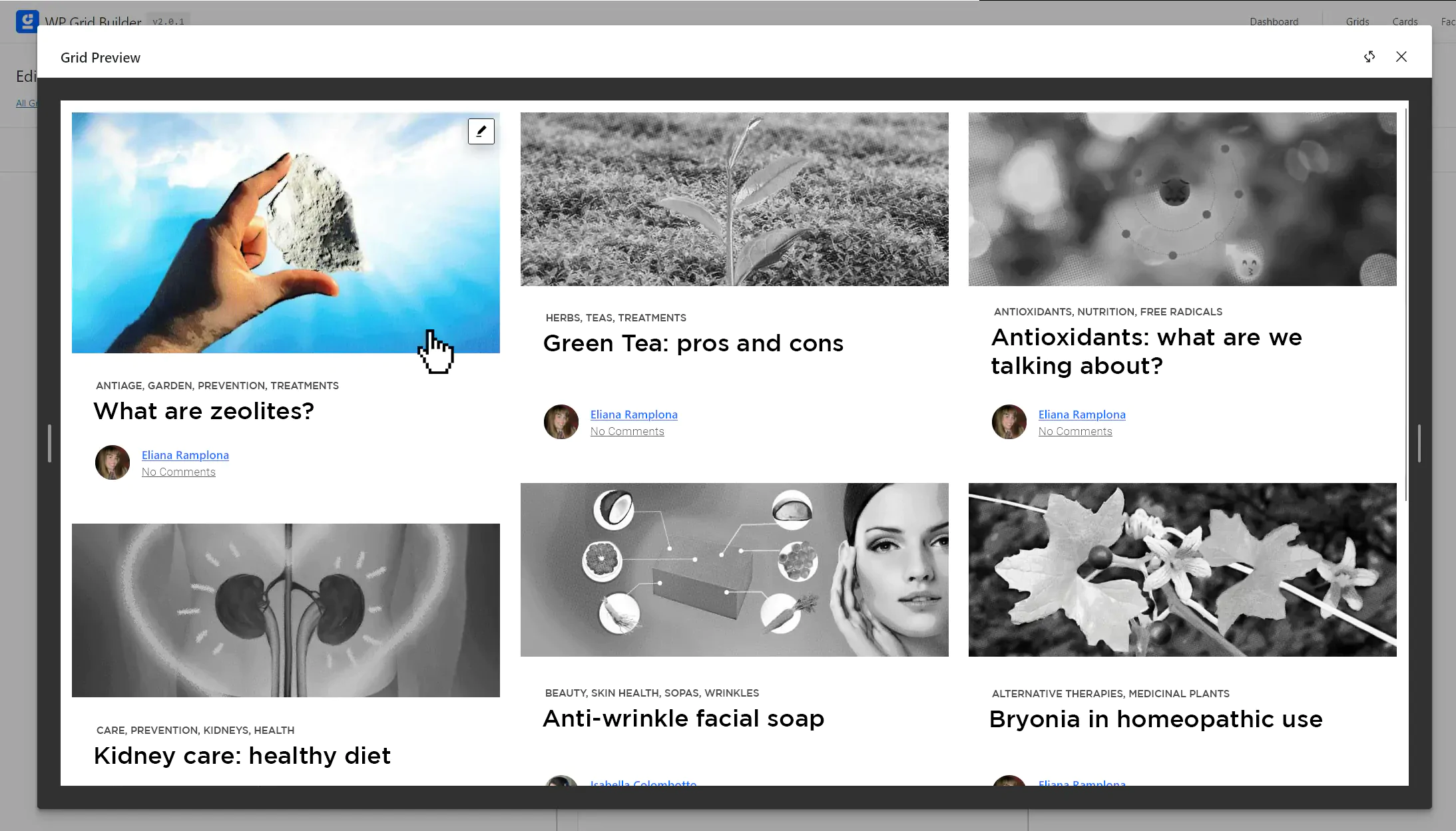
In this example, we see the Blog results as we quickly configured them. Images turn to full color only when we hover over them, but this can be easily modified. If we’re not entirely satisfied with link colors, text styles, or fonts, we can adjust them via the Gutenberg blocks in the Card editor. We can also remove blocks—such as comment information or author details—if they’re not needed.
Regarding structure, if we feel something needs improvement, we can go back to the relevant grid design section.
An essential and complementary part of content presentation is allowing users to organize it based on their needs or preferences. That’s where search filters come in. In WP Grid Builder, as we previously mentioned, they are called Facets.
We can create as many Facets as needed (though we’ll start with just one), depending on our website’s requirements.
To do this, we need to navigate here:
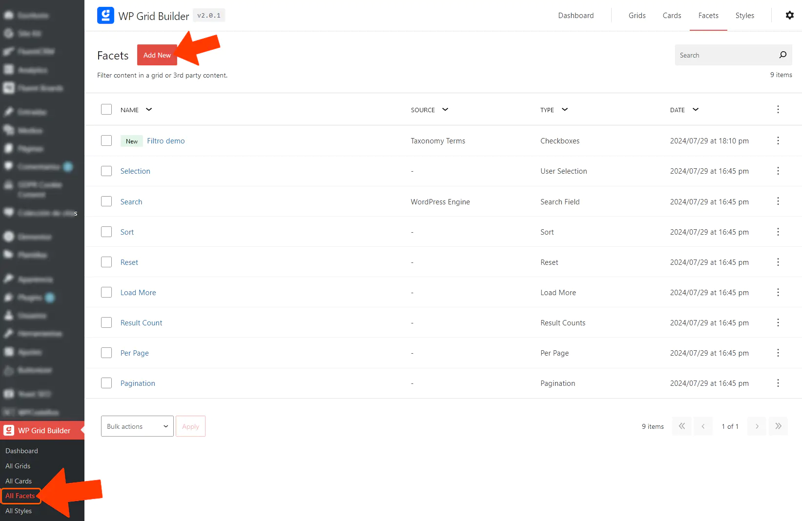
By default, WP Grid Builder includes several pre-existing Facets. Think of these as elements or blocks that we can insert using Gutenberg or our preferred page builder (such as Elementor). For instance, we’ll find a search bar (Search), a Load More button, and more.
Now, we’ll create a filtering Facet for our blog, keeping in mind that the process is the same for a store or portfolio.
After clicking Add New, we’ll see the following creation screen:
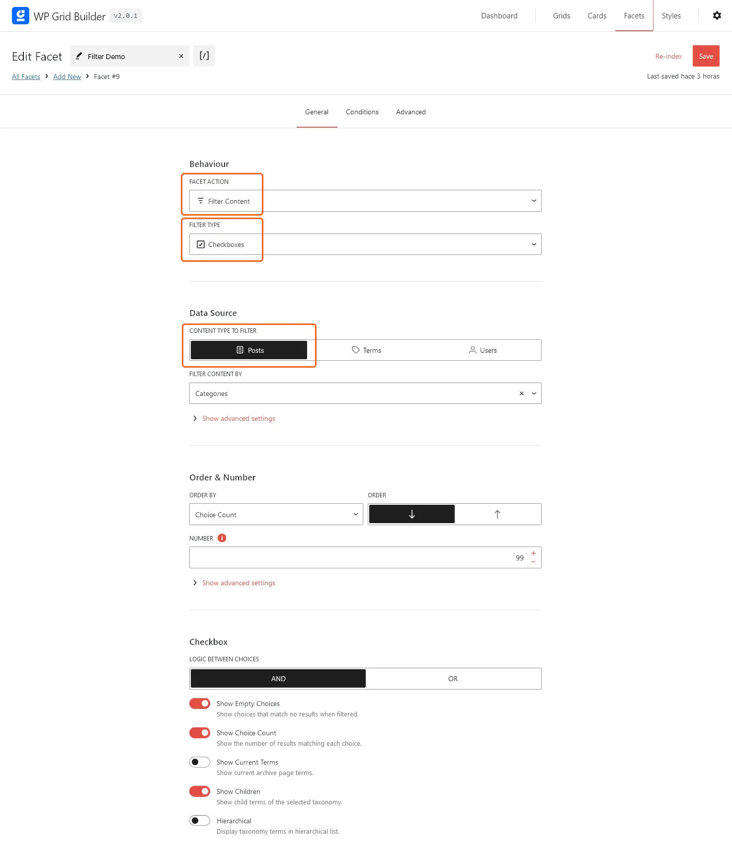
In the Facet Action dropdown, the default option is Filter Content, which we’ll leave as is.
Under Filter Type, we have a dropdown with all the usual options: checkboxes, dropdown menus, sorting (A to Z, reverse, numerical order, etc.), range filters (useful for prices), and more. Since we want to filter by category, we’ll choose a Dropdown menu.
In Data Source, we can enable or disable content types for the filter (if WooCommerce is installed, we’ll see products here as well). Since this guide focuses on a blog, we’ll select Posts and filter by categories.
This section lets us define how elements are sorted within our grid.
An essential setting here is the choice between AND and OR conditions, which determine how multiple filter criteria interact.
As always, remember to save the changes.
When designing our pages, we can integrate the grid elements and the filter box we just created using the widgets provided by WP Grid Builder in WordPress.
In Gutenberg, for example, we can find them here:
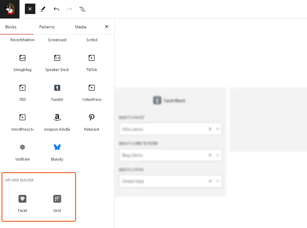
Thanks to its seamless integration with WordPress, WP Grid Builder allows us to add our Grids and Facets anywhere on our website.
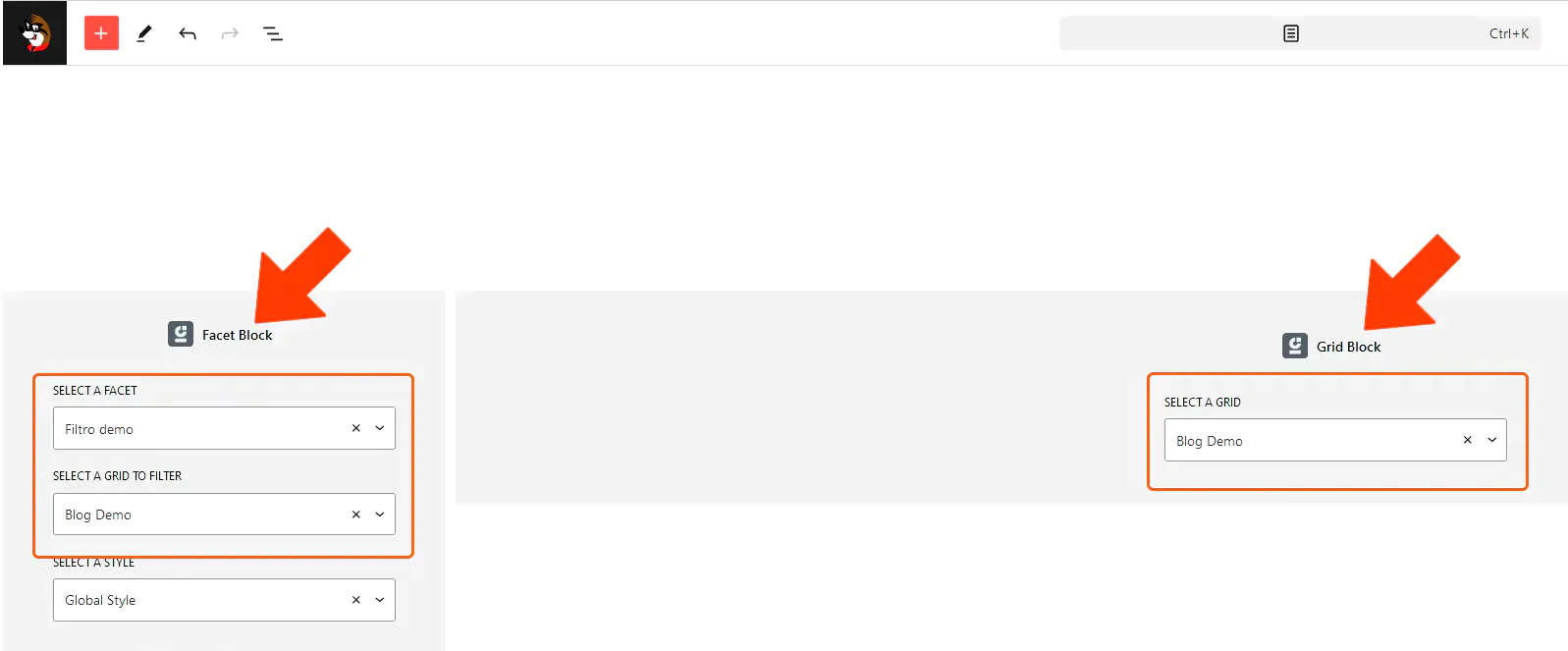
In the following example, we created a full-width two-column table. On the left side, we added a Facet, making sure to correctly enter the name of the filter we previously created. On the right side, we inserted the Grid widget and configured it to display our custom grid.
With this final step, we have completed our beginner’s guide to WP Grid Builder.
While WP Grid Builder is user-friendly and offers an extensive range of configuration options, the sheer number of possibilities comes with a slightly steep learning curve —especially for those new to mosaic layouts and element filtering. Without a guide (like this one, of course), reading the official manuals in English or watching the tutorial videos on YouTube can feel tedious or impractical. Because of this, some users may prefer a quicker alternative that doesn’t require as much time investment. However, once you navigate through this learning phase, chances are you won’t want to go back.
Another downside is the lack of a free version. WP Grid Builder is only available through paid plans: Basic, Premium, and Ultimate, starting at $49 per year for a single site. Depending on the country or the type of developer, this cost might be a barrier or a decision they wouldn’t make upfront without testing the product first.
Lastly, if all you need is a simple grid with basic filtering rules, this plugin might feel like overkill. There are more lightweight options available for those with less complex needs.
WP Grid Builder stands out for its versatility, the extensive customization options, and the freedom it provides to create advanced, filterable grids without limitations. It’s designed for users who want full control over their content display, without the frustration of encountering restrictive design barriers.
This plugin is ideal for any type of website, whether it’s an eCommerce store, blog, or portfolio. Its intuitive interface makes it accessible for both beginners and experienced developers.
Additionally, WP Grid Builder integrates seamlessly with popular WordPress tools like WooCommerce and Elementor. Its powerful features —advanced filtering, faceted search, and Ajax-optimized performance— make it arguably the best grid presentation plugin available today. It’s not an option that can be easily overlooked.
Reminder: WP Grid Builder is included for free as part of the 30+ premium plugins available in our WordPress Maintenance Plan.
Thank you for reading, and we wish you success in your projects. We’re here to help!