The new version of Bricks has been released, laying the groundwork for creating professional websites for 2025 and beyond. This update brings features chosen by the community, which received over 30,000 votes in total.
Bricks is included as part of our plugin package with WordPress Plus.
Builder capabilities
Originally, Bricks offered only three types of access permissions for its users: “Full Access,” “Edit Content,” and “No Access.” While this was sufficient in the early stages of Bricks, with the availability of new tools, an evolution is now necessary. Version 2.0 addresses this access dilemma with the release of “Builder Capabilities.”
Now, in the WordPress admin panel, you can define custom permissions for each user or role. To do this, go to “Bricks > Settings > Builder Access.”
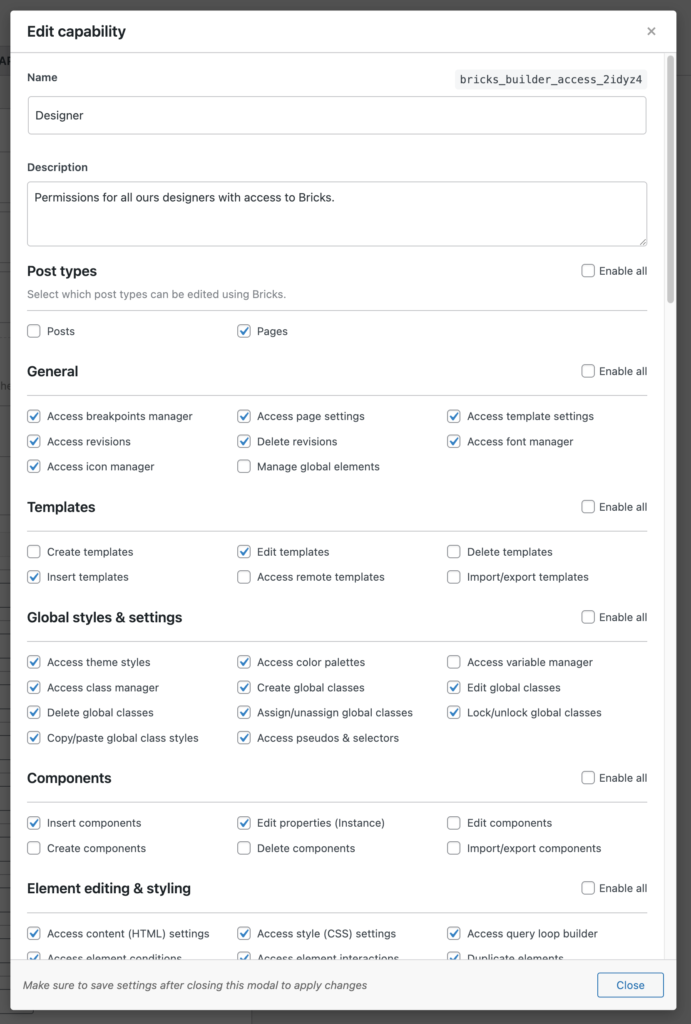
This new feature allows you to define more than 50 individual permissions for the following areas:
Post Types: Select which post types can be edited with Bricks.
General: Access specific Bricks features (Icon Manager, Font Manager, Breakpoint Manager, etc.).
Templates: Define template editing functions.
Global Styles and Settings: Access theme styles, color palettes, global class and variable manager, etc.
Components: Define component editing functions.
Element Editing and Styling: Access query loops, content and/or style settings, etc.
Edit Elements: Set element editing permissions.
Add Elements: Set permissions for adding elements.
Element Manager
This new tool allows you to limit the number of Bricks elements available on your website. Since it’s unlikely you’ll ever need to use all 110+ native elements, you can now disable any you want, whether to tidy up the builder, improve performance, or more.
In the WordPress admin, these options can be found under “Bricks > Elements” and can be set to one of the following modes:
Active: The element is visible in the builder and the frontend. This is the default behavior.
Hidden (Builder): The element is not visible in the builder’s elements panel, but is displayed in both. Elements can also be added via import, copy and paste, etc. This option only clears the elements panel; it does not disable the element.
Disabled: A disabled element does not load in either the builder or the frontend.
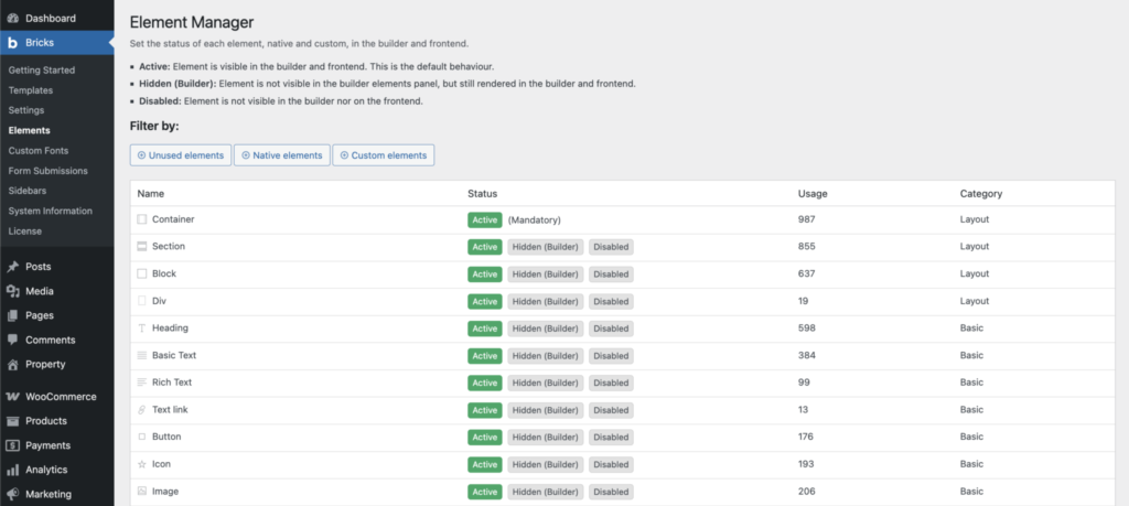
Elements can be filtered by:
- Unused elements
- Native elements
- Custom elements
This feature precedes the previously mentioned “Builder Capabilities” feature, so if we disable an element here, it will not be available to any user.
Builder UI: Revamped
The interface has been improved with higher contrast and improved readability. The control groups and the structure panel have a refreshed look, and the theme styles panel has been cleaned up, with all individual elements nested under the “Elements” group. The preload screen is now truly dark, and the pseudo-class UI has found a new home outside of the builder toolbar.
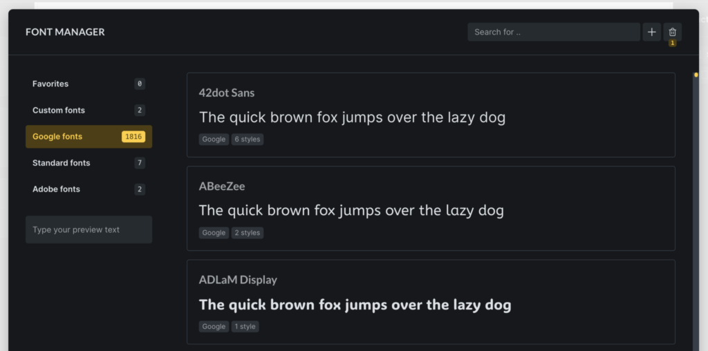
Font Manager (In the builder)
The new Font Manager is accessible from the WordPress admin panel by going to “Settings > Font Manager” or by clicking the gear icon on any font dashboard, allowing for professional-quality font addition and management. Some of the new features include:
- Create custom fonts by quickly uploading all font variation files in one step.
- Browse and download any Google Font with a single click to host locally (GDPR compliant).
- Mark individual fonts as favorites to narrow down your font family selection in the builder.
- Move fonts to the trash without immediately deleting them.
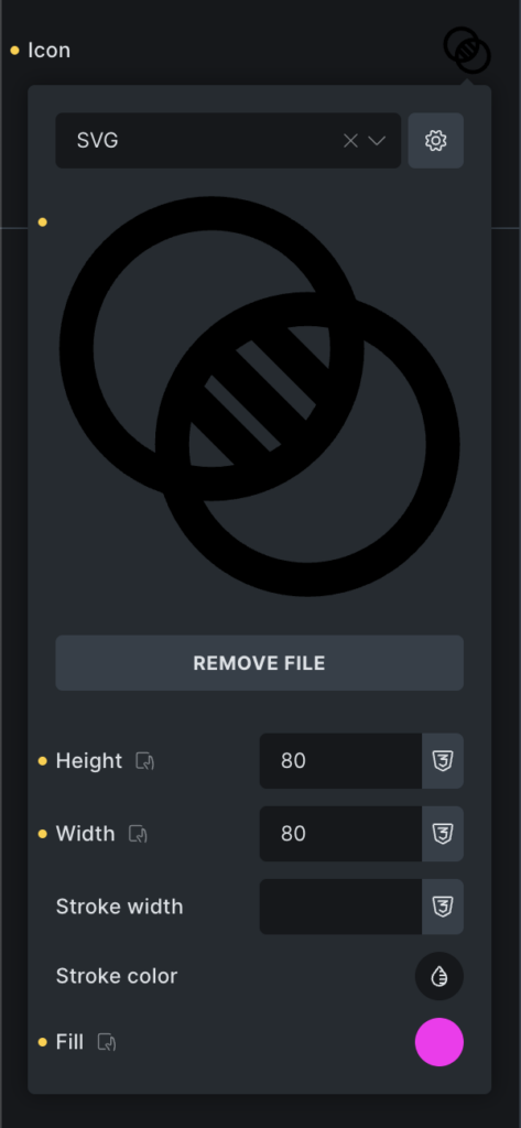
Icon Manager (In the builder)
The new Icon Manager 2.0 allows you to create and manage your own icon sets. This setting can be accessed from Settings > Icon Manager by clicking the Options button.
Features:
- Create custom icon sets (upload your own SVG files).
- Use these icons in any icon control and SVG element.
- Adjust the height, width, stroke color, and fill of your icons.
- Disable any icon set, even built-in ones (previously configured icons will be displayed and rendered).
SVG Styles
Prior to version 2.0, icon styles were only applicable to the design’s base size.
This limitation has now been removed, and you can now define SVG icon styles (height, width, stroke width, stroke color, fill) for any resolution or global class.
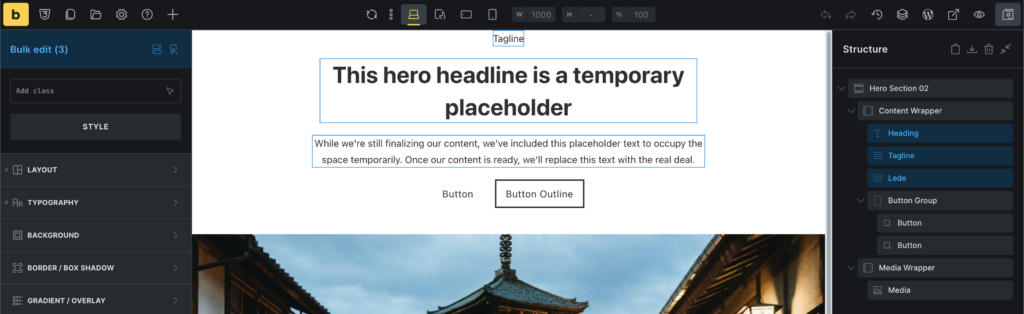
Joint editing of elements
This is a massive change to improve your workflow. Bricks now allows you to select multiple elements to edit at once. To do this, hold down CMD/CTRL and click on the elements you want to edit in the workspace or in the structure panel. You can also select a series of elements between the first and last selected by holding down the SHIFT key.
Supported bulk editing actions
The options for editing together depend on the selected elements. If all the selected elements are the same, for example, if we select three headings, joint editing can be done in the Style and Content tabs. If the elements are different, only the Styles tab will be available.
Supported Bulk Editing Actions
In addition to editing elements together, it’s possible to move them at the same time if they’re within the same parent element. It’s also possible to duplicate, delete, and wrap selected elements. Finally, you can assign new classes to groups of selected elements. Pre-assigned classes won’t be displayed, as each element can and likely has different default classes assigned.
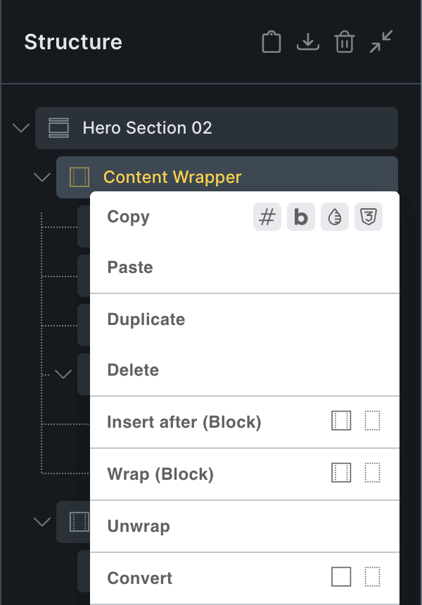
Context menu: Unwrap
Now in Bricks 2.0 you can select any element in the page structure and right-click on it and use the new “Unwrap” action to remove the selected element and move all its nested elements into place.
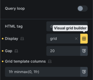
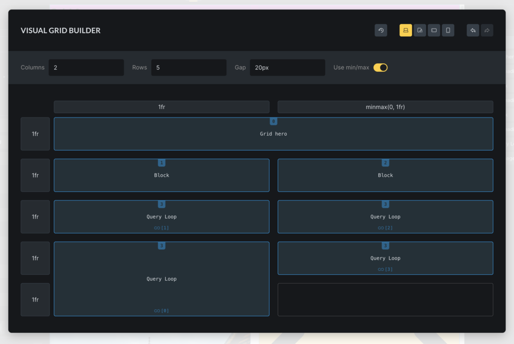
Visual CSS Grid Builder
Finally, we want to mention another great tool that Bricks 2.0 brings us. While it’s been possible to create CSS grid layouts in Bricks for some time now using simple text input, it was never as easy or enjoyable an experience as it should have been.
If you weren’t familiar with the rules for creating CSS grids, this process became a tedious exercise in trial and error.
The new “Visual CSS Grid Builder” makes this process more user-friendly. To access this feature, you’ll find the “grid” icon next to the “Display” control if the display value is “Grid.” Clicking this icon will open the full-screen CSS grid editor, where you can edit and modify the grid layout to your liking, without having to write any code.
Visual Grid Builder Interface
Once this interface is open, you’ll clearly see a representation of the currently selected grid. This allows you to easily adjust the number of columns, rows, and the gap between them.
If you want to adjust the size of an individual element, simply interact with the cursor by dragging one of its corners until you achieve the desired result. If you want to move an item, simply drag and drop it wherever you like.
For more information about this complex tool, Bricks has published an article dedicated exclusively to the features it offers.
Final conclusions
Bricks is a lightweight visual builder with a lot of potential. Its influence and available tools are such that we’ve even noticed Elementor preparing to incorporate some of them, such as the use of classes, in future versions.
Although still in its alpha version, we recommend keeping Bricks under your radar and giving it a try, at least in a testing environment, to understand its potential and know how to choose the right builder for your next project.
